
Stronger Together: The Future of the Yeronga Devils
The club is excited to officially share the next step in the future direction of the Yeronga Devils, with the junior club and senior club coming together under one connected identity.
This transition includes updated club branding, a new logo, and the development of one central website designed to create a stronger, connected, and professional presence across the entire club.
As the club has continued to grow, the current structure, branding, and online presence no longer fully reflect the activity, size, and future direction of the club. This transition is about building a stronger foundation for the future while creating a clearer and more unified identity across all levels of the club.
The alignment of juniors and seniors will help:
- Create strong recognition of the Yeronga Devils identity
- Modernise the club’s online and visual presence
- Strengthen pathways through the club
- Improve communication and consistency across all divisions
- Support stronger long-term opportunities for sponsorship and growth
Teams, training, game days, and the strong community culture of the club will continue as normal. Like any club, our history is important to all of us, and this change is not intended to disrespect that history. Our club has changed its name and logo several times throughout its history, as have many other clubs. We will also be incorporating elements of our current brand into various aspects of the club, ensuring that part of our history and identity continue to be recognised and respected moving forward.
The updated branding also helps create a stronger connection between juniors and seniors, allowing players across all age groups to feel part of one unified club and pathway.
As part of the transition, a central website will be introduced to create a more modern and accessible hub for players, families, supporters, and sponsors. This will ensure information remains current and accurate throughout the season.
Yeronga Devils Update FAQ’s
What is changing?
The junior and senior clubs are aligning under one connected identity.
This transition includes the introduction of a new club logo and structured brand guidelines designed to create a stronger and more recognisable presence moving forward.
Key changes:
- New logo/s and updated structured branding
- One club identity across juniors and seniors
- One central website
- Consistent communication and presentation across the clubs
The intention is to create a more connected, professional and future-focused presenting club while supporting stronger opportunities for growth and sponsorship.
What is NOT changing?
The junior club and senior clubs will remain separate clubs with separate governance and financial structures.
What is the goal of this transition?
The main goal of this transition is to strengthen the club’s overall presentation to create better opportunities for long-term growth and sponsorships.
A strong identity, modern website, and consistent communication help present the club in a professional way and better reflect the quality of the clubs both on and off the field.
This transition is intended to:
- Support long-term growth across both clubs
- Remove confusion around the senior club’s name and location identity – current location says South Brisbane on logo
- Create strong brand recognition
- Create a strong sponsorship platform
- Improve how the clubs are presented publicly
Why bring juniors and seniors together?
Bringing the clubs together helps create clearer pathways from juniors through to seniors while also improving communication, consistency, and overall presentation.
Though they still operate separately, the clubs can be presented as one connected organisation with shared values, direction, and identity. The transition also helps reinforce a unified culture across all divisions while presenting a more inclusive and progressive direction for the future of the club.
One identity strengthens community recognition, builds stronger connection across all levels of the clubs, and creates greater value for sponsors and partners.
How does the website affect sponsorship?
For many people, the website is the first impression they have of the club.
The senior website has been outdated and does not fully reflect the professionalism or activity of the club. Information can also be difficult to navigate or inconsistent across different areas.
A more modern and unified website helps present the club as active / up to date, organised, professional and easy to engage with. This creates more confidence for sponsors, players, and families looking into the club.
Why does the logo need to change?
A strong modern brand is increasingly important when attracting sponsors and community partners, and helps better reflect the quality, growth, and future direction of the clubs. The refreshed logo and branding give the clubs a more modern and professional presentation.
The current logo also creates some confusion with “Yeronga South Brisbane”, which is not the name most people within the community commonly recognise or refer to the senior club as. It also does not strongly align with the club’s widely recognised on-field identity as the Devils.
Introducing a refreshed identity alongside the alignment of juniors and seniors helps create stronger connection across both clubs. Junior players can wear the same logo as the senior teams, feel connected to the broader club identity, and look up to the older players as part of one unified identity.
The intention is not to move away from the club’s history, but to build on it with an identity that better supports the future direction of the club.
How can the old logo still be used?
The previous logo can still play a role in recognising and celebrating the club’s history.
The club’s branding and logo have evolved previously over time, and this transition continues that natural progression while helping create a clearer and more unified identity moving forward.
Possible uses for the old logo can include:
- Historical displays around the club
- Past players or club history content
- Anniversary & milestone celebrations
- Memorabilia items
This allows the clubs to move forward with a stronger and more modern identity while still respecting and acknowledging the history that helped build the club into what it is today.
What does this mean for players and families?
For families and players, there will be very little change to day-to-day club involvement or operations.
Teams, training, game days, and the overall community environment will continue as normal. The main changes relate to the club’s branding, presentation, website, and overall alignment between juniors and seniors.
Families would not be expected to do anything differently as part of this transition, aside from gradually seeing the updated branding and communication rolled out across the club.
Our New Brand
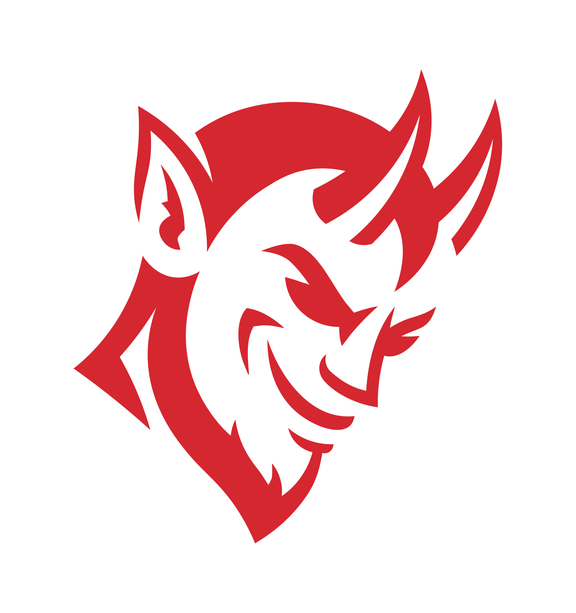
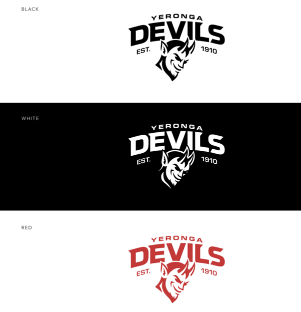
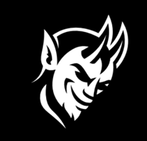
Primary Logo
This is our primary logo, the badge that represents the club and should be used wherever possible. It is the most recognisable symbol of the Devils and should be used across major club applications including uniforms, merchandise, signage, digital platforms and official club communications
The logo has been created intentionally to show balance of confidence and mischief that captures the identity of the club while creating a strong, memorable mark that stands proudly across uniforms, merchandise and the wider club environment.
The inclusion of Est. 1910 acknowledges the long history and legacy of the club, recognising more than a century of players, supporters, families and community behind the Devils name. It reinforces the pride, tradition and strong foundations the club continues to build on today.
The white logo should be used on dark backgrounds, the black logo should be used on light backgrounds, and the red logo should be used on light backgrounds for strong contrast and visibility.
Logomark
The logomark is designed for smaller placements where the full badge would become illegible. This is ideal for uses such as social media profile images, tags, or other compact applications.
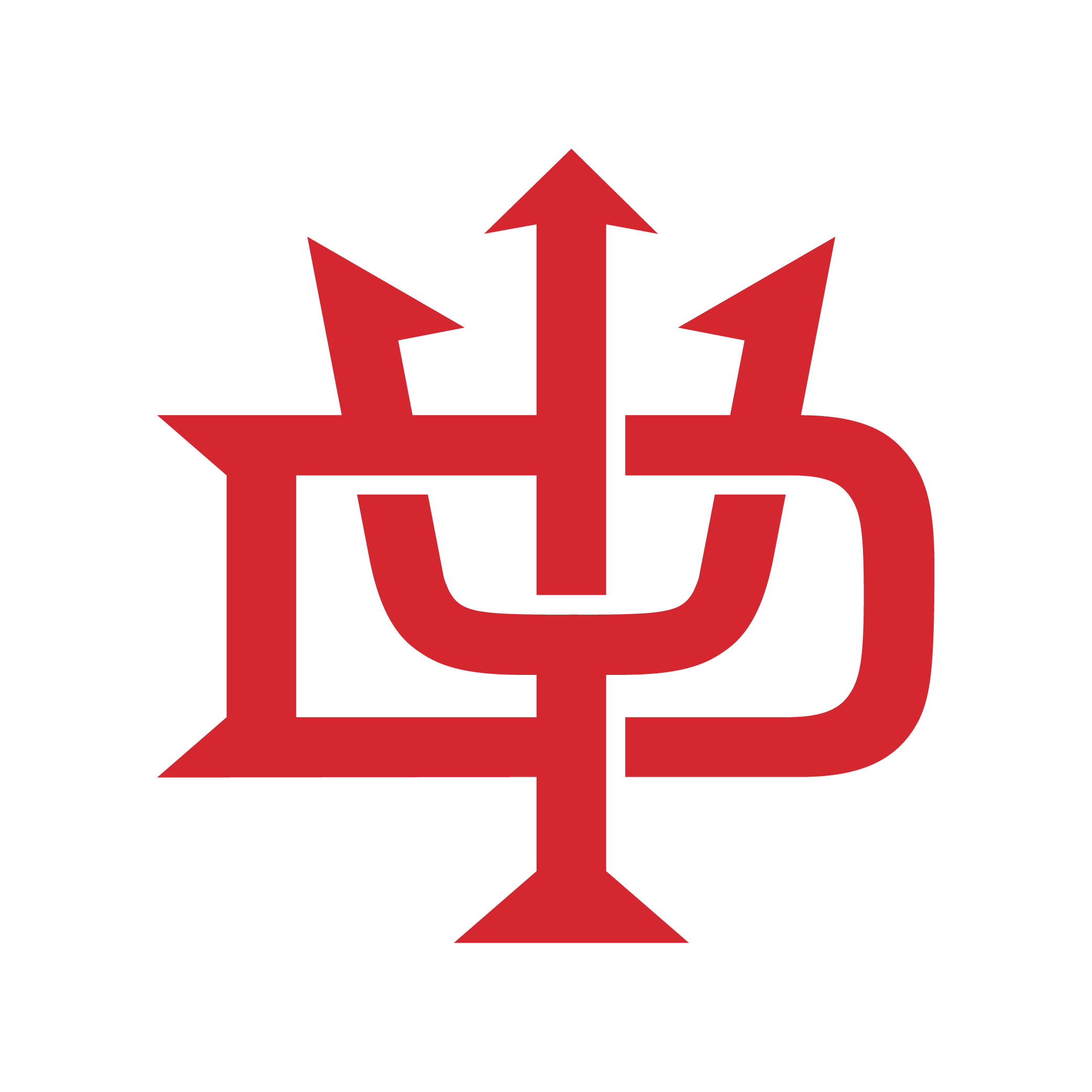
Monogram
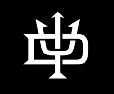
This design serves as a subtle nod to the club’s previous SB monogram, helping retain a connection to the club’s history while moving the identity forward.
The monogram is intended for more subtle or professional applications where the full badge may feel too detailed. This may include caps, letterheads, official club documents, training gear etc.
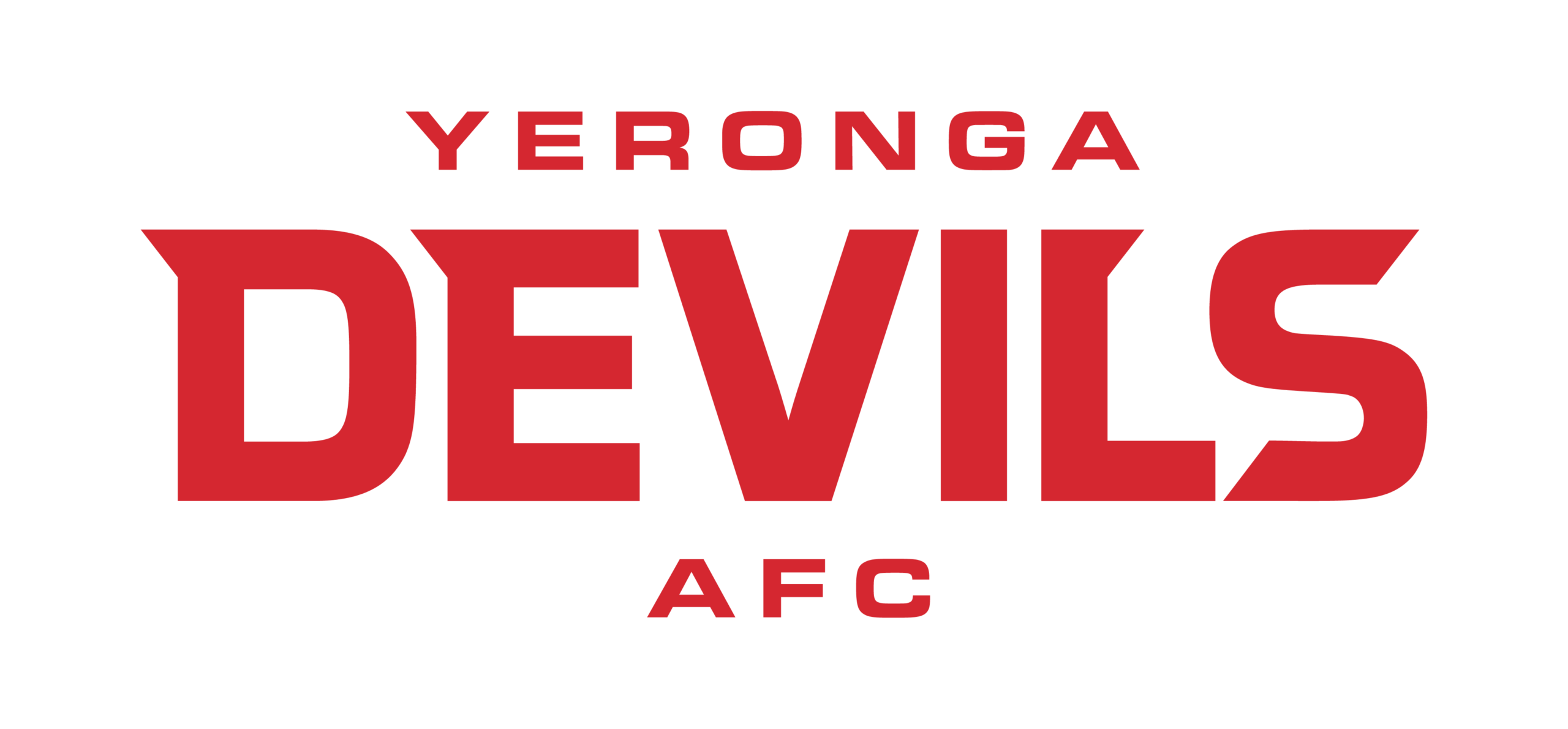
Wordmark
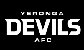
The wordmark should be used in situations where the full badge is unnecessary, but the organisation’s name needs to be clearly communicated. This may include signage, headings, or one-off placements where a simple expression of the name is preferred.
Why do the logos have specific uses?
Following the brand guidelines helps create a strong, professional and recognisable identity for the Yeronga Devils across everything we do. The logos have specific uses and rules to ensure the brand always appears clear, consistent and connected, no matter where it is seen.
Using the wrong logo, colours or layouts can weaken the identity and create inconsistency across the club. By using each logo variation as intended, we help protect the integrity of the brand and continue building a unified identity the entire Devils community can be proud of.